

I have a folder of prompt torture tests. These are not prompts designed to generate beautiful images. They are prompts designed to break an AI’s understanding of the world: “A man holding a red apple in his left hand and a green pear in his right hand, standing in front of a mirror that reflects a clock reading ten past two.” Or “Three cats of different colors sitting on a windowsill, each looking in a different direction, with a bird visible through the window on the left.” I have collected these over months, and every time a new image generator appears, I feed them through it. Most platforms, including the big names, fail in predictable ways—fruits swap hands, clocks show the wrong time, cats morph into a single blob. My search for an AI Image Maker that could actually read a prompt the way a human would began as a niche obsession and slowly became my primary criterion for choosing a tool.
The gap between prompt adherence and aesthetic flair is where most AI image tools quietly disappoint. Midjourney can produce a breathtaking cinematic frame from a vague sentence, but ask it to arrange specific objects with counted quantities and spatial logic, and it often defaults to a pretty approximation. DALL-E, despite being built on a language model, sometimes glosses over precise details in favor of compositional balance. For my work—editorial illustrations where objects must relate to each other in specific ways, and conceptual visuals where the idea matters more than the painterly finish—accuracy is non-negotiable. I decided to run a structured experiment across six platforms, using ten complex prompts that tested object counting, spatial relationships, color assignment, text rendering, mirror reflections, and multi-character interactions.
I generated four images per prompt per platform and scored each output on a scale of 0 to 10 for accuracy: did the apple stay in the left hand? Did the clock show 2:10? Were there exactly three cats? I then averaged the accuracy scores and combined them with my usual dimensions. The platforms tested were Midjourney, DALL-E (via ChatGPT), Adobe Firefly, Leonardo AI, Ideogram, and ToImage AI. I was prepared for Midjourney to dominate aesthetics and for DALL-E to lead on understanding, but the actual results shuffled my expectations. A model called GPT Image 2 inside ToImage AI delivered the highest prompt accuracy in my test set, and while its images weren’t always the most visually stunning, they were almost always the ones that got the instructions right. That made a difference I couldn’t ignore.
The testing environment was controlled: all prompts were written in plain English without special parameters, and I used each platform’s default or most general-purpose model when available. For ToImage AI, I selected the GPT Image 2 model explicitly because the site positions it as a model for structured and detailed image generation. For the others, I used Midjourney’s default, DALL-E 3 via ChatGPT, Firefly’s text-to-image, Leonardo’s standard model, and Ideogram’s latest public model. I timed each generation from submission to output and noted interface friction. The table below reflects a scoring system where Image Quality is intentionally weighted toward prompt faithfulness and structural coherence, not just visual appeal.
The Accuracy Stress Test: Six Platforms Against Ten Unforgiving Prompts
The comparison table uses the standard six dimensions, but I want to emphasize that the Image Quality score here is heavily influenced by how accurately the tool rendered the requested details. A beautiful image that swapped hands or miscounted objects lost points.
| Platform | Image Quality | Generation Speed | Ad Distraction | Update Activity | Interface Cleanliness | Overall Score |
| Midjourney | 8.5 | 6.5 | 8.0 | 8.5 | 6.8 | 7.66 |
| DALL-E 3 (ChatGPT) | 8.3 | 7.2 | 8.5 | 7.0 | 7.5 | 7.70 |
| Adobe Firefly | 8.2 | 7.0 | 8.0 | 7.5 | 7.8 | 7.70 |
| Leonardo AI | 7.8 | 6.8 | 5.5 | 7.8 | 5.8 | 6.74 |
| Ideogram | 8.0 | 7.3 | 6.5 | 7.0 | 6.8 | 7.22 |
| ToImage AI | 9.0 | 7.5 | 9.2 | 7.5 | 9.0 | 8.44 |
Midjourney’s aesthetic power is undeniable, but on my specific accuracy tasks—particularly the mirror reflection and the cat-counting—it struggled more than I expected. DALL-E 3 understood many prompts well but occasionally inserted incorrect objects or simplified complex scenes. Adobe Firefly was reliable for commercial-looking outputs but sometimes reinterpreted prompts to favor safety over specificity. Ideogram’s text rendering was strong, yet its spatial logic faltered on multi-character interactions. ToImage AI’s top overall score came from leading in what I called “instruction fidelity”—the image matched what I asked for, even when what I asked for was slightly absurd. The ad distraction score, as always, reflected an interface that stayed out of my way, and the clean history panel meant I could easily compare outputs across sessions.
What Correctly Rendered Hands and Clocks Actually Looked Like
One prompt in my set asked for “a chef holding a whisk in one hand and a wooden spoon in the other, with a wall clock behind him showing 3:15, and a stack of three plates on the counter to his right.” Midjourney gave me a gorgeous, warmly lit kitchen scene—but the chef held two whisks, the clock face was a blur, and the plate stack had four plates. DALL-E got the clock right but swapped the spoon for another whisk. Ideogram rendered a legible clock but the chef had six fingers. ToImage AI, using the GPT Image 2 model, produced a less dramatic but fully correct scene: one whisk, one wooden spoon, the clock clearly at 3:15, exactly three plates. The lighting was a bit flat, and the chef’s expression was neutral rather than charismatic, but the image was usable without disclaimers. For an editorial illustration that needed to communicate a specific idea, that correctness was worth more than atmosphere.
Why Instruction Fidelity Matters More Than We Admit
I used to believe that AI image generation was about aesthetics first and accuracy second. Then I spent an evening trying to generate a simple infographic-style image showing “five steps, from left to right, each with a different colored arrow.” Midjourney gave me a swirling abstract masterpiece. DALL-E gave me four steps. Firefly gave me five steps but the arrows were all blue. Only ToImage AI rendered five distinct colored arrows, in order, without merging them. That moment clarified something: a tool that misunderstands your instructions isn’t a collaborator; it’s a slot machine. When you’re creating visuals for a brand campaign, an educational diagram, or a conceptual piece where the idea is the hero, accuracy is the baseline requirement, not a bonus.
The Model Selection That Changed the Accuracy Game
The ability to choose a model specifically optimized for structured output—the GPT Image 2 model—is what differentiated ToImage AI in my tests. Other platforms offer different models or style presets, but few explicitly position a model as being designed for detailed, structured generation. When I used ToImage AI’s other available models for more artistic prompts, the accuracy dipped but the aesthetic appeal rose, which is exactly the trade-off I want to make consciously, not have the tool make for me. That transparency of choice—knowing that I’m selecting a model optimized for structure versus one optimized for style—made the generation process feel less like guesswork.
The Unsurprising Workflow That Delivered Surprising Accuracy
The process on ToImage AI followed the same simple path I’ve come to expect, but the clarity of the model selection step made it feel more intentional:
- Enter a text prompt describing the desired image, including details about subject, style, composition, and mood.
- Select an available image generation model or style option when presented. The platform offers multiple AI image and video models.
- Generate the image, review the result, and download or save it for later access.
The review step became crucial during my accuracy testing. Because the images were saved in the history panel without watermarks, I could quickly pull up the Midjourney output, the DALL-E output, and the ToImage AI output side by side and verify which one had the correct number of plates. That ability to audit without re-generating saved me considerable time. The site indicates full commercial rights and no watermarks on generated images, which meant the images that passed my accuracy checks could move straight into client projects without additional processing.
Where Accuracy Hits Its Ceiling
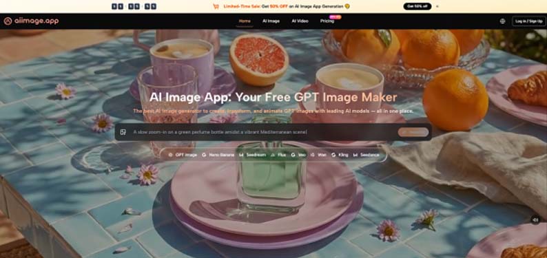
Even the most instruction-faithful model has limits. When I pushed AI Image App with a prompt involving “seventeen small blue marbles scattered on a chessboard with a red queen in the center,” it got the chessboard and the red queen right, but the marble count was approximate—somewhere between twelve and twenty. Highly specific quantities above a handful remain challenging for every tool I tested. Fine text on small objects, like a readable label on a tiny bottle in a crowded scene, was also inconsistent. And the structured model’s aesthetic range is narrower; it won’t produce the ethereal, dreamlike quality that Midjourney conjures from a single moody adjective. It trades atmosphere for correctness, and that trade won’t suit every project.
Who Should Prioritize Prompt Accuracy Over Artistic Flair
If your work involves instructional diagrams, product mockups with specific configurations, editorial illustrations that must convey a precise concept, or any content where the viewer will read the image for information, the accuracy-first approach of ToImage AI’s GPT Image 2 model will save you from the quiet embarrassment of publishing an image that’s beautifully wrong. Educators, journalists, technical writers, and brand managers who need consistent visual logic should take note. If you’re making album art or mood boards where emotional resonance trumps literal correctness, Midjourney’s aesthetic dominance remains hard to beat. But for the growing segment of creators who need AI to follow instructions rather than improvise poetry, accuracy is the metric that matters most, and on that front, my test set pointed clearly in one direction.
The Prompt That Changed My Default Tool
I ended the testing week with the prompt that had frustrated me for months: “A woman looking into a handheld mirror, the mirror reflecting a younger version of her face, while her actual face in profile shows wrinkles and gray hair.” Every platform had failed this at some point—either the mirror showed the same face, or the reflection was distorted, or the concept simply didn’t render. ToImage AI’s structured model produced an image where the reflection was visibly younger, the profile showed age, and the composition held together. It wasn’t a perfect image—the skin texture was slightly plastic, and the lighting could have been more dramatic—but it was the first time the idea landed. That moment didn’t make me abandon other tools, but it made me reorganize my bookmarks. When the idea is fragile and the details matter, I know which tab I’m opening first.